The packaging of different containers requires the use of different fonts to suit their styling and structural characteristics. Boxes, bags, and other square shape can be used in a variety of fonts; bottles, cans, cylinders and other cylindrical shape, the font should not be too fancy; irregular packaging should pay attention to the font should be easy to identify, simple, clear, but also take into account Package modeling body, face relationship, proportional relationship and other factors. The combination of the figure in Figure 3 with the word "Tongxintang" and the shape of the plaster indicates the nature of the proprietary Chinese medicine. The cornerstone of the design is the focus of the design, which adds to the dynamics and also has a visual direction.
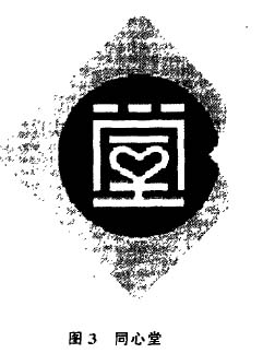
Figure 4 "Spring" uses illustrations. The upper part changes the image of an adult, and the lower part of the word "sun" transforms into the image of the earth. The overall shape of the word gives people a colorful and full of vivid personality.
2.2 Latin text
Latin texts are also widely involved in packaging. Usually Latin fonts are divided into three categories: writing, printing, and art, depending on the style of the font. Can be used for packaging design accordingly.
Changes in the form of Latin fonts and Chinese characters can also be divided into the following categories: shape change, stroke changes, structural changes, graphic changes and pictographic changes in five categories, through the changes in the production of a variety of font image. The change of Latin text also needs to pay attention to the characteristics of content attributes first, and at the same time pay attention to the structure, size, thickness and other proportions of the font and the harmony of the spatial relationship.
Figure 5 "Palbic" font design, the shape of the letter P changes with the shape of b to form a care. Similarly, the shape change of a corresponds to the C shape. The background color of the P character echoes the dot on the i and the spatial processing is very fine.
In the font design of Figure 6 "GI OCAL", the arc of the letter G is the same as the arc of () and C. G and L, C and A use a continuous stroke design technique to combine into a very harmonious and unique overall image. Stroke space The distribution is extremely balanced.
2.3 Text Format
In addition to fonts, the layout of the design of the text is another important factor in the formation of the packaging image. Arrangement processing should not only pay attention to the relationship between words and words, but also pay attention to the relationship between rows and groups, groups and groups. The text layout on the package is based on overall considerations in different directions, positions, and sizes. Therefore, in form, it can produce richer and more lively changes than the general arrangement of the text of the book.
In addition to the adjustment of thickness, kerning, and area, the line spacing should be clearly different from the kerning. For a more regular explanation text, the general spacing is 3/4 of the word height. Of course, texts with decorative changes can be flexibly mastered.
The basic requirement of choreography design is to design according to the contents of the content, starting from the overall image, according to the order of the text itself, to grasp the layout of the focus, balance and change. The so-called emphasis does not necessarily mean a certain part, but it can also be a trend or feature of the overall image. As for the changes in the format of the arrangement, there is no certain pattern and it can be generally divided into the following common types: horizontal, vertical, oblique, circular, step, axis, repeat, and so on. . The above forms are just a few examples, and various forms can be combined with each other. In the actual arrangement, more forms can be designed. However, as a formal means, arrangement and graphics, colors, and fonts are all "languages" that express design intent. Therefore, the design must be based on the premise of the performance of goods. It should be noted that it must be adapted to the characteristics of the goods, and at the same time pay attention to the novel, unique, and clear layout changes. We should not only pay attention to the latter but ignore the former. Cause the cart before the horse.
3 Conclusion
Text design is an important part of packaging design. It is an essential ingredient to convey product information. Good packaging pays much attention to the text image design, and some even completely decorate the screen with text. Well-designed brand image must have a well-designed text image set off each other. Like the design of the font, graphics, and color, we must first strive to reflect product attributes and personality, and pay attention to features and characteristics. The premise of design is still to display the product, but no matter how the design changes, the text must have good identification and legibility.
Yin Zhangwei Hubei Wuhan University
Source: "Journal of Zhuzhou Institute of Technology"
The Jewelry Gift Box can be in different sizes and colors. Not only are many of the jewelry boxes and gift boxes recycled but they are also recyclable, providing eco friendly packaging solutions without compromising style. All boxes are perfect for decorated, not just a packaging box but also a Gift Box with lovely jewelry inside.

Jewelry Gift Box
Jewelry Gift Box,Gift Box,Luxury Gift Box,Jewelry Packaging Gift Box
Shenzhen Hongte Printing & Packaging Co., Ltd. , http://www.ipackpaperbox.com